One of the aims of Unicode is to make possible and relatively straightforward to create, for example, an English text with quotes in German, Arabic, Hebrew, and many other languages. A typesetter understands, however, that it is not enough to have a uniform digital representation of the “letters”: one also should have a font (or collection of fonts) with letterforms for all these scripts. Therefore an important task for font designers is to create fonts with large collections of glyphs for different scripts. Only when this is done can we say that we can make multi-language books with truly harmonious and beautiful pages.
One may think that this task became relevant only in recent times. Giambattista Bodoni (1740–1813) is a great reminder that this impression is just wrong.
Typophiles may remember Bodoni for his great Latin fonts, which still are widely used today, or for his influential editions of classics. However, another aspect of Bodoni’s heritage becomes increasingly more important in today’s interconnected world: his extensive work on non-Latin scripts. These scripts interested Bodoni throughout his career. Starting at the age of eighteen Bodoni worked with the exotica division of the Tipografia Poliglotta Vaticana where his work spanned Arabic, Tibetan and many other scripts. Later, in Parma, he published a collection of bridal poems in 25 Oriental languages with Latin translations (1775). As a mature typographer, Bodoni published Oratio Dominica, the Lord’s prayer in 155 languages (1806). He personally cut 55,000 matrices for his multi-language books. Bodoni strived to combine calligraphic traditions of these scripts with the beauty and clarity of his superb typography.
TeX users may want to take a look at GFS Bodoni fonts (http://www.ctan.org/pkg/gfsbodoni) with full support for Greek, Latin and math. They are included in TeX Live and MiKTeX, as well as being available directly from CTAN.
The book Manuale Tipografico is a major work of the great typographer. He did not live to see it printed: his widow Margherita and his foreman Luigi Orsi completed the edition and published it five years after the master’s death.
The first volume of the manual contains a huge collection of samples of Latin fonts: roman, italic and cursive, with variants, weights, sizes. Margherita wrote in her preface that Bodoni considered it necessary for good typography to carry a collection of main fonts large enough so the difference between the adjacent sizes is not easily seen by a trained eye—a feat almost unheard of before the advent of digital typography.
The second volume has an extensive collection of Greek and Cyrillic fonts, along with a huge number of other scripts: Hebrew, Tibetan, Arabic, Armenian, Coptic, Georgian and many, many others (curiously enough, black letter is also considered to be an “exotic script” and put in the second volume as “Tedesco”, German—between “Malabarico”, Malayalam, and “Russo”, Russian). Bodoni himself in his preface evidently takes a considerable pleasure in listing the fonts, carefully observing the difference between Square Hebrew and Rabbinical Hebrew, and noting that in Arabic writing …the intricate Sulsi letter is employed in frontispieces and beginning, the hanging Tajik is very fashionable in Persia, while Turks love the reverse Divân. The preface also contains important musings by Bodoni about the fundamental of typographic art.
The book also includes many pages of astronomical, mathematical and medical symbols, decorative rules, ornaments and even musical sheets in several styles.
Besides being a huge source of invaluable information, the book is a pleasure to read; just turning its pages may make a great evening for a typophile.
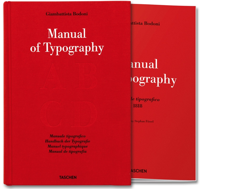
Since its publication in 1818 the Manuale became a very rare book. In 1965 it was reprinted in 900 numbered copies, which, of course, immediately became a prized rarity themselves. Thus a new mass market edition by Taschen is a very welcome project. A well preserved copy from Staatsbibliothek zu Berlin is reproduced here in all its glory. For those readers who are not fluent in Italian the book contains a booklet in a pocket glued to the inside cover with the translation of the texts and a very interesting preface by Stephan Füssel, director of the Institute of the History of the Book at the Johannes Gutenberg University of Mainz and the editor of the publication (most of the facts about Bodoni’s biography cited above can be found in this erudite and well-written foreword). The book is printed on a good thick paper and is well bound. Probably in order to keep the price lower this edition contains both volumes of the original Manuale in one large book (albeit with two tassels). This makes it rather heavy (about nine pounds) and somewhat difficult to handle. However, the binding allows one to open the book at any place without much problem.
This book is a must for a font specialist or a typographer. Its relatively low price and beauty make it a good addition to a library of a book lover.