The history of fonts and font design is an important part of our heritage. The TeX community, in a tradition started by Knuth, appreciates the fine aspects of typography, and has always been keenly interested in fonts.
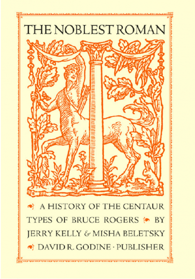
The Centaur font by Bruce Rogers is a classical font created at the beginning of the last century based on the immortal designs by Nicolas Jenson in the 15th century. The first full version of this font was cast in 1915. The book by Jerry Kelly and Misha Beletsky is a tribute to the centennial of this typographic treasure.
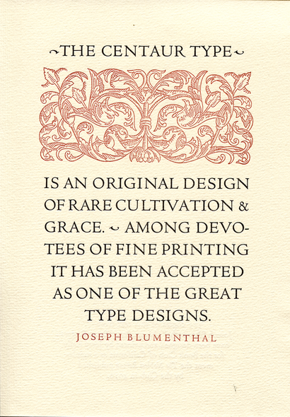
There are poets’ poets and painters’ painters: the writers and artists who foremost influenced their colleagues and inspired their creativity. Bruce Rogers probably deserves the title of typographers’ typographer: his fame among book artists became, as another great typographer and Rogers’ rival, Stanley Morison called it, “a BR cult”. The quotation below by Joseph Blumenthal, beautifully typeset by Jerry Kelly for the Book Club of California edition of The Noblest Roman, well describes the opinion of professionals about Centaur:
Kelly and Beletsky quote similar praise for the font by such masters as D. B. Updike and Robert Bringhurst.
Interestingly enough, this acclaim among artists, as often happens, did not translate into commercial success. As the authors note, during the entire production run of Monotype Centaur from 1929 to 1980 only 754 sets of matrices were sold— fifty times less than Times New Roman and ten times less than Monotype Garamond. The font is not well known by the general public. Maybe this is why we do not have free Centaur digital fonts for use with TeX; certainly such fonts would be a great contribution to the TeX typographic arsenal.
The authors note that the high regard for Centaur among typographers created many legends about its history. The incomplete and often unreliable recollections by Bruce Rogers himself, amplified by other narrators, lead to a situation where “little can be taken at face value”. Kelly and Beletsky took great pains to check details using archives, letters and other little explored sources. They performed a great service in elucidating the true story of Centaur. The book explores the relations between Rogers and his employees and contemporaries, the evolution of the design, and many interesting details, such as the attempt to create a version of the font for the Justowriter typesetting typewriter (1948).
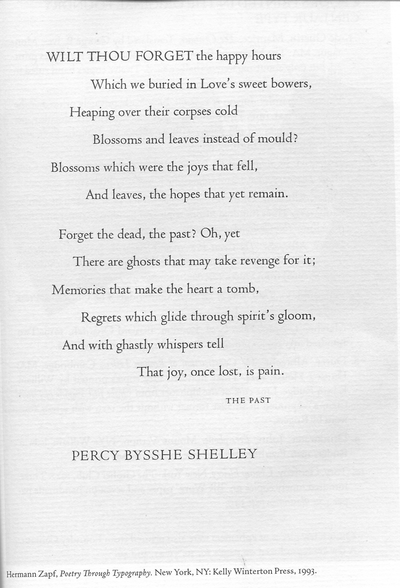
While the book text is very interesting, its illustrations are truly superb. The Noblest Roman reproduces many pages of books typeset with Centaur. Below is the page from a book designed by Hermann Zapf:
Besides comprehensive type samples, The Noblest Roman includes a list of books typeset with the original Centaur as well as detailed notes, a bibliography and a carefully compiled index.
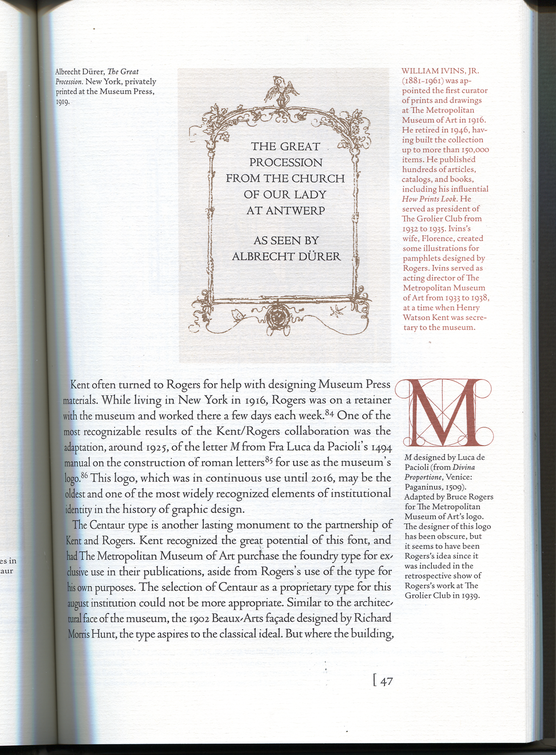
The book is beautifully typeset by Jerry Kelly, whose work has been reviewed several times before in these pages. It is a masterpiece of the typographic art. The book is printed in two colors, with black and red marginal notes. The marginalia contain succinct biographies of typographers of this time, small illustrations and captions for larger illustrations in text:
To tell the truth, I am not sure why other notes, such as bibliographic references, are relegated to the back of the book rather than being typeset in the margins as well.
The book is typeset in Centaur (of course!) using three recent digital revivals of the font: the body text in the font by Jerry Kelly, the captions in the version by Toshi Omagari (used for the first time in this book), and displays in Monotype Centaur. The body text is justified with ragged right marginalia.
The publisher, David R. Godine, is well known for his books of highest quality, also often mentioned in these TUGboat review pages.
I thoroughly enjoyed this book and heartily recommend it to typophiles in the TeX community.